Transactions
Transactions are at the heart of blockchain and so they are typically shown right on the home screen of any wallet. Users quickly want to see if a transaction they made was processed and if any new new ones have come in.
Transaction lists
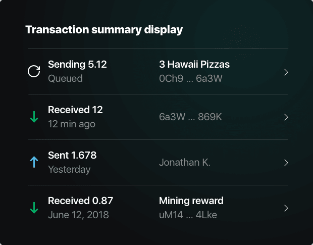
Wallet designs for transaction lists are really diverse at the moment. Some provide only basic facts and read more like database outputs, while others show too much information resulting in tiny fonts. In this type of list, users just need to have a few basic questions answered, so they can decide whether they want to click/tap to see all the details:
- Why was this transaction made?
- What type of transfer was this (payment, deposit, vote...)?
- Which currency was this in (for multi-currency systems)
- What was the amount?
- Who sent it?
- When was it made?
- Did it go through?
That's a lot of information to pack in a small area, so each piece needs to be carefully considered and placed.
Examples
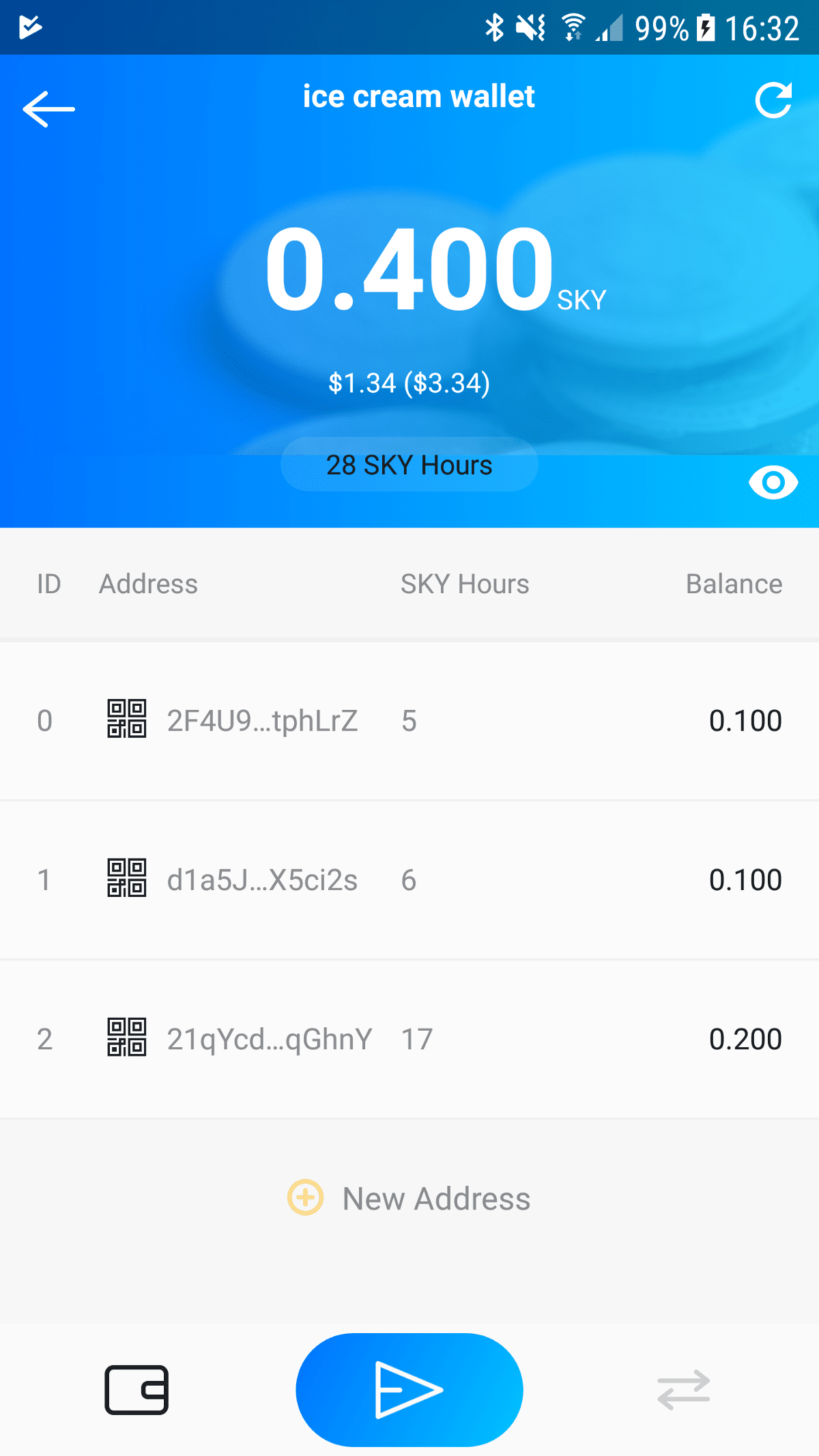
Skycoin for Android, Version 1.1.1, August 20, 2018
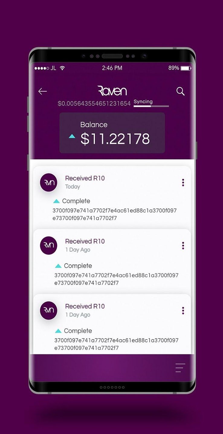
Ravencoin Android wallet, Version 1.1FI, September 4, 2018
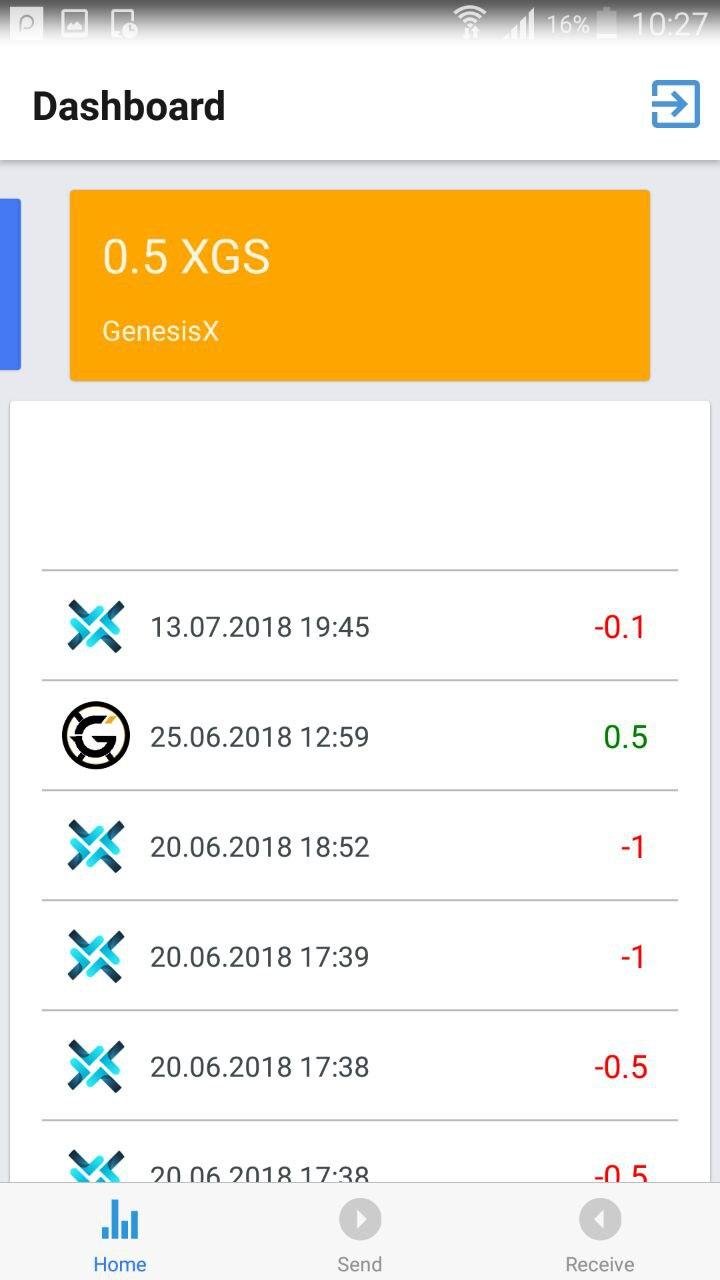
Trittum app, Version 1.0.0, August 16, 2018
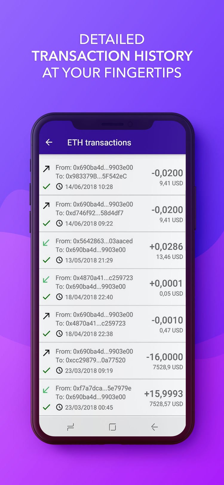
Citowise - Ethereum Wallet, V 1.7.3, Sep 19, 2018
Transaction details
These screens typically duplicate the information shown in the transaction list screens and show it in a slightly expanded format with more labels and context, and then show a host of secondary information (fees, transactions IDs, etc). Users typically look for the transaction status ("Did it go through?") and want a way to share a receipt or transaction confirmation.
Examples
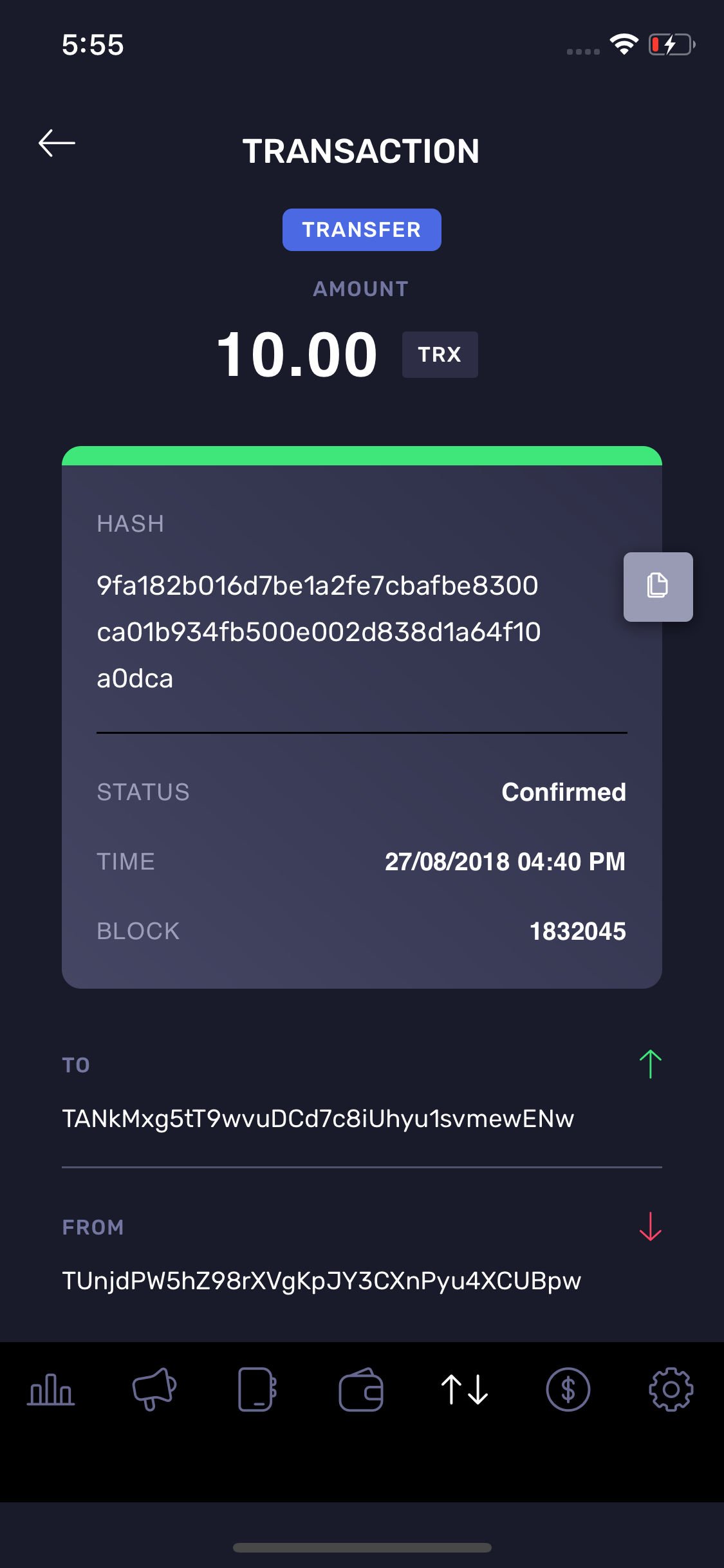
Tron for Android, Version 1.1.5, August 30, 2018
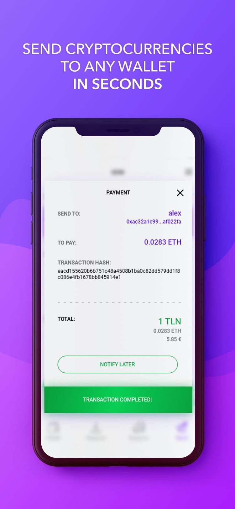
Citowise - Ethereum Wallet, V 1.7.3, Sep 19, 2018
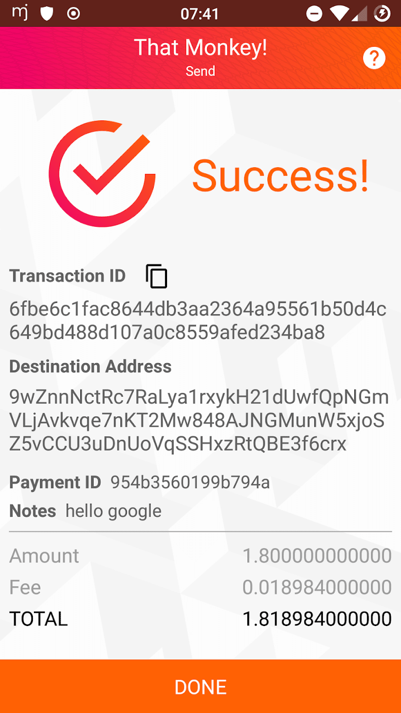
monerujo, V 1.6.4, August 20, 2018